
Attention is now focused on U.S. states as they continue making progress on developing their clean energy economies. Twelve states have already passed Clean Electricity Standards (CES) to rigorously, ambitiously, and expansively drive transition to zero emitting energy generation. Clean Air Task Force (CATF) has closely analyzed these policies and their differences, and developed a framework with key legal design parameters so that other states can best adapt CES policies to suit their local needs.
To make this complex knowledge as accessible as possible, CATF wanted to build an interactive map that served as a resource for states when making policy decisions. Earth Genome was thrilled to take up a new challenge to develop and visualize structured data of complex legislative and energy technology information. Policy is largely embedded in written legislation that is not standardized for use in analysis and applications. This makes it difficult to understand and compare targets across states, and there just are not very many sources available to make this information more accessible. In a world where knowledge is power, it’s important for this data to be consolidated and usable by those that are working to take action.
Energy policy TLDR
We had to quickly get up to speed on the nuance of energy policies, and could not have asked for better teammates than CATF to guide us through. Here are some of the key things to understand.
Renewable Portfolio Standards are rules that say a certain percentage of electricity must come from renewable sources like wind, solar, and hydropower. For example, a state might say, “By 2030, at least 50% of our electricity has to come from renewables.” Power companies then have to build or purchase more wind and solar power to meet that goal.
Clean Electricity Standards are a relatively new type of policy and are broader in practice. These policies include not just renewables but also other energy sources that produce no or low carbon pollution, like nuclear power or fossil fuels with carbon capture. A CES might set a goal like, “By 2040, 100% of our electricity must come from clean sources.”
These policies push energy companies to invest in a certain percentage of the grid that must be generated from non-polluting sources, and by setting these policy milestones, it helps track this shift and hold accountable those that can facilitate the transition. CES policies help by expanding the technological targets for investment and ensuring a reliable mix of electricity.
Dialing in the requirements
Before we build anything it’s important to figure out what we actually need to build. This process can take many forms and in this instance we ended up following a lean approach and iterating quickly to come up with the final design. The initial kickoff started by simply asking a lot of questions with the CATF team, getting as much detailed input from stakeholders and working to get the ideas out of heads and down onto paper. We gained shared context on the policy landscape, and developed a good understanding of the policy advisors and policy-makers we were building for. As simple as it may be, this is a critical step in communication that if skipped can lead to unmanaged assumptions and time lost in rework.
We then translated this understanding into wireframes for the CATF team to provide feedback on. Depending on the project, Earth Genome will then move into mockups, or quick interactive prototypes to test out ideas. With the CES map, we used Figma to iterate on design quickly, working with the core project team through several work sessions on the mocks. We then opened up to a larger stakeholder group to confirm we were on the right track.
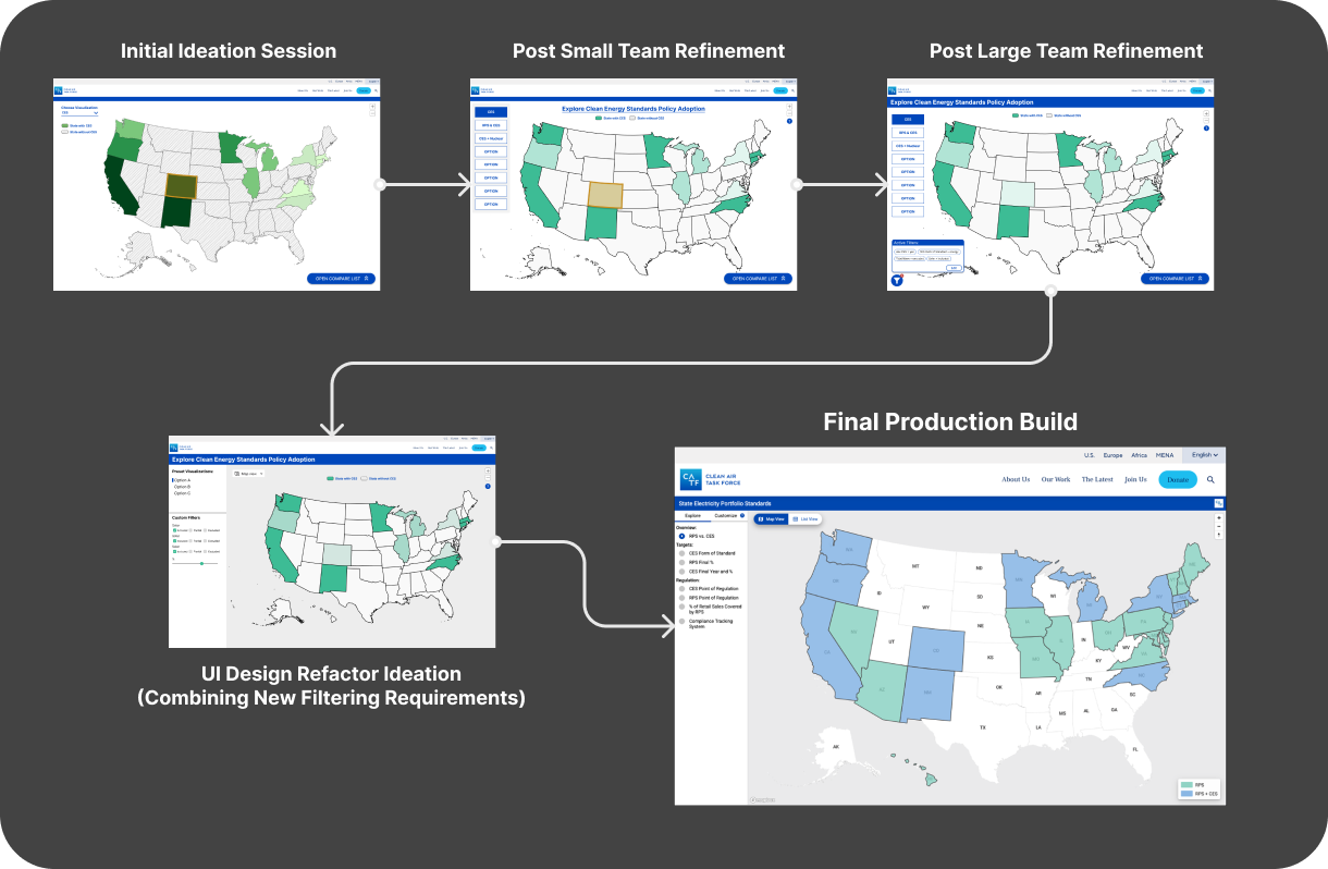
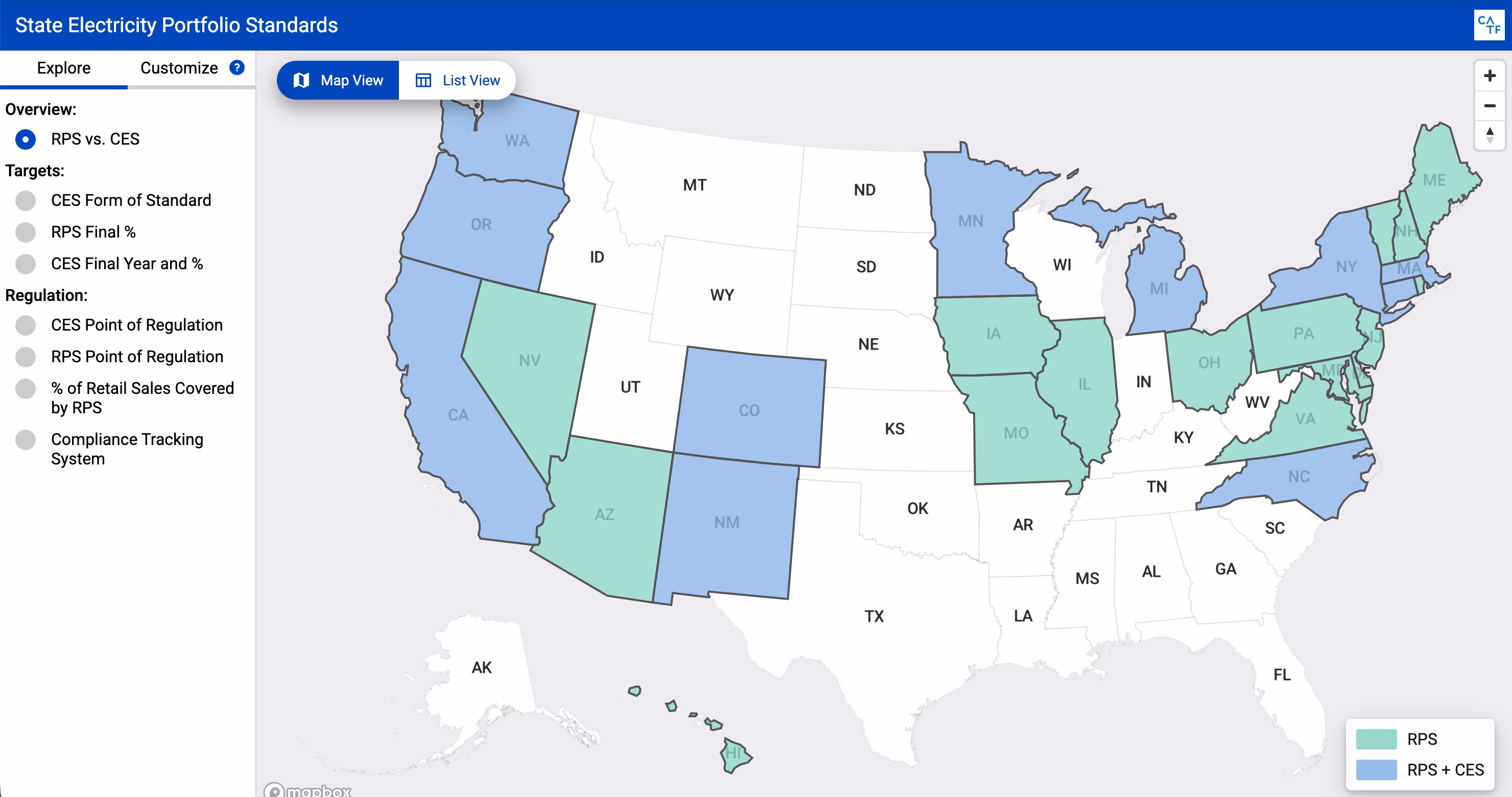
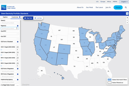
Feedback at this stage focused on the importance of offering several ways of digging into the data, from quick visual impressions to deeper analysis. There is a map, to visually compare differences across states and regions. And different parameters can be applied for visual exploration on the map. States can be filtered by any number of policy properties. And there is a list view, to carefully examine distinctions in policy. It was delicate work to get the right balance of these four different ways of interacting with the data.
Data structures for the law
While the UX and UI work was chugging away, we also were tackling another challenge: the data. When the project started, there was no data to grab off the shelf. Instead, staff at CATF worked relentlessly to compile the important details out of the legislation and resources like the Lawrence Berkeley National Labs Report on State Energy Standards. However, since this data came from different states and there are no national guidelines on what RPS or CES must include, the data had plenty of challenges. Our team worked closely with CATF policy experts to turn this data into a structured table that had types that could be mapped to machine readable formats. Through quite a few data refinement sessions, we ended up with a complete and structured format we could build against.
Build time
Once we had the design mostly ironed out, we were ready to finally kick off the build. We used Vite + React, paired with Mapbox GL for maps and AG Grid for the list view, along with a sprinkling of AntD and Redux. All this helped us to get up and running quickly.

For the map, since the dataset was tied to the United States (including Alaska and Hawaii) it made sense to go with the Albers projection. This is not an out of the box projection supported by Mapbox, so we had to get our hands dirty, specifically by using dirty-reprojectors from Development Seed which allowed us to conveniently convert our datasets so they would render looking like Albers USA. We say like because it’s really just a trick to render the geometry into coordinates that appear as an Albers layout but really exist within a typical web mercator map. One downside to this is that basemaps won’t work, so we also had to run this reprojection for things like our labels, but all in all it was a great solution to visualize the data on a more effective map layout for the user. Before landing on Albers we also considered inset maps to show the non-contiguous states however we felt that the projection change created a cleaner map area without subdivisions and helped with consistency between map interactions such as panning and zooming. The Albers USA route allowed us to keep a high data-ink ratio where most of the pixels on the screen are used to show relevant data.
Maintaining a lean backend throughout the build presented some challenges — and by “backend,” we mean an exported CSV. While a static export worked well for our non-transactional dataset, CATF staff would have to intermittently update the data as states changed their policies. This meant the CSV was dynamic, with new rows added, values updated, and other edits that could affect the ETL script preparing the data for the application. To manage this, we implemented a robust ingest script to parse the CSV and validate its structure. We also set up a versioned testing environment where staff could confirm updates before pushing them live. Additionally, we provided comprehensive documentation, including video tutorials and handoff meetings, to ensure a smooth update process. While this approach wasn’t perfect, it gave us confidence that we had mitigated the risks of working without a structured database.
A smooth handover
Anyone who has ever taken over a software project knows the challenges of a bad handoff. It can be even worse when that handoff came from someone outside of your organization and you are left trying to put all the pieces together and make it work. To avoid this, we worked closely throughout the final days to not only assist and address bug fixes from an expedited QA process but also wrote documentation, recorded video how-to’s, and had direct handoff calls to confirm the documentation was thorough enough to ensure the project’s success after we had moved on to other work. We especially made sure to comment and clean our code well and record detailed deployment and repository overview videos to onboard future developers quickly if any enhancements were needed. The CATF team needed to take ownership of not only the code repository but also the deployment infrastructure, as well as gain the ability to push data updates independently. This required us to establish clear communication methods so that non-developers could confidently use GitHub to manage versioned data updates. After a few practice sessions and well-structured documentation, they were able to make revisions without ongoing developer involvement.
Check it out
You can find the live final project, along with a multitude of supporting materials expertly crafted by the policy folks over at Clean Air Task Force. We really enjoyed working on this project and the challenge of adapting policy knowledge to structured data and interactive tools.
Do you have environmental research and knowledge you’d like to make much more accessible? Get in touch, and we’d be glad to help you make an impact.
Other articles

.png)
The AI Knowledge Problem
Report out on building decision support tools for nature credit project design
.png)

Engineering updates on sustainable AI at Earth Genome
Behind the scenes sustainability improvements on patch grid generation, STAC metadata, energy transparency, and DB optimization.
