At COP30, our partners Amazon Conservation and Pulitzer Center launched the new version of Amazon Mining Watch. We built many new features into Amazon Mining Watch to support growing data usage across the Amazon:
- Time-series tracking of mining activity across jurisdictions, protected areas, and Indigenous territories
- Economic impact estimates showing the dollar cost of socio-environmental damage
- Illegality risk assessment for detected mining areas
- Quarterly data updates instead of annual releases
- Mobile-optimized interface for field reporting
In this post we’ll do a deep-dive into these features, why they’re important and how we built them.
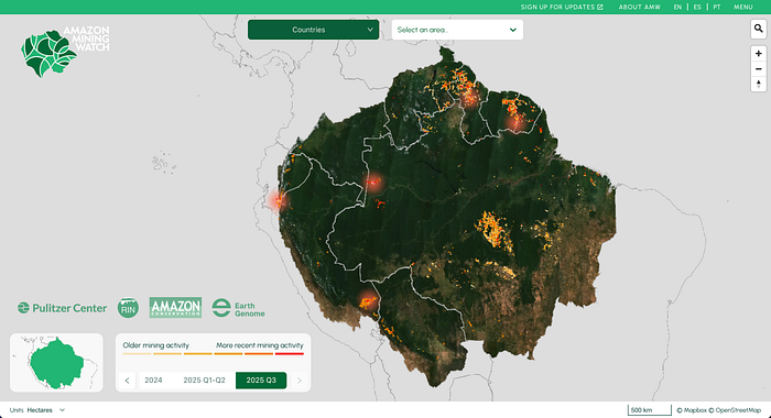
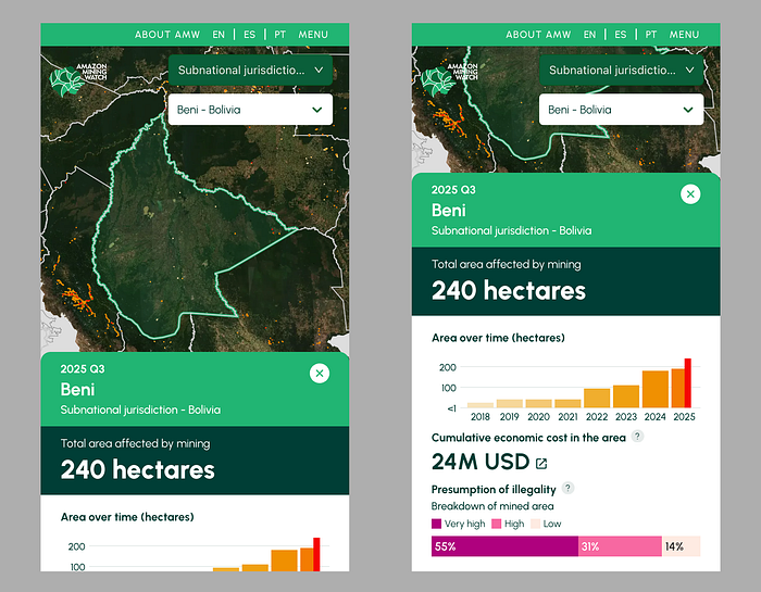
Tracking Mining Activity Over Time and Place
For reporters and campaigners, it is important to have details on mining trends, as well as visuals to back up their stories and demands. The prior version of the AMW website only provided visual mapping of cumulative activity up to a certain year. For this new release, we added both a set of geographies to filter the map, as well as charts to track mining over time.
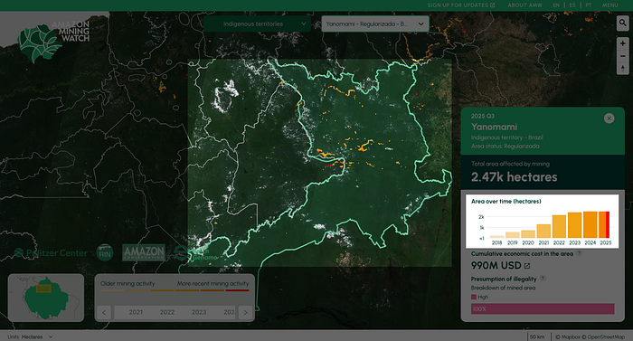
For example, this allows users to see where and how much mining has increased in the Yanomami Indigenous territory in Brazil, for example, between 2018 and the third quarter of 2025, and highlight where currently active mining fronts are located. We calculate these areas specific measurements as part of our data pipeline (more about that in a future post on updates to our modelling and data), and make it easily available for users on the AMW interface.
Estimating Economic Costs of Mining
In addition to displaying the area affected by mining, we now show the estimated economic cost of mining activity in the jurisdiction. We do this by integrating with the Conservation Strategy Fund’s Mining Impacts Calculator API.
By providing the API with the area affected by mining as well as the subnational jurisdictions they are in (for example, municipalities in Brazil), we’re able to display an estimate in US Dollars of the total socio-environmental impacts caused by mining.
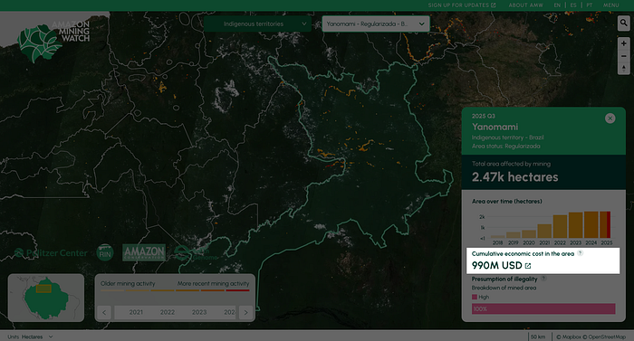
This includes an assessment of the costs of deforestation, erosion and silting, and mercury contamination. This allows further stories and claims on the impacts of mining in Indigenous areas and other protected territories across the entire Amazon.
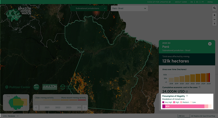
Assessing Illegality Risk for Mining
Not all mining detected in the Amazon is necessarily illegal, as some operations have proper permits and follow national regulations. To address these distinctions, we’ve integrated an illegality risk layer into the website.
We surface this information at the bottom of our jurisdiction summary, in the form of a bar chart that shows what percentage of mining falls within the illegality risk categories defined from “very high” to “low” risk of illegality.
In the Pará state in Brazil, for example, more than 85% of mining detected there falls within areas with either high or very high risk of illegality. This highlights the potential extent and challenges of addressing illegal mining in the Amazon.
Quarterly data updates
One of the big changes in this version of AMW is that we’re now displaying data updates quarterly instead of yearly. Besides all the data work that went into it, this entailed a few changes to our interface.
We now display all of the mining areas at the same time on the map, using a yellow-to-red color palette to reflect older vs. more recent mining activity. Users can also either filter the time period on the lower left, or scrub the area bar chart to display only a certain period.

Mobile updates
Lastly, we’ve made AMW more friendly for users on mobile devices. When a user selects an area, we display the data summary for that area as a card that overflows the display vertically. This allows the user to scroll vertically to see both the map and the summary data at a quick glance.
Explore the Data
These updates give journalists, campaigners, and researchers the evidence they need. Explore the new features at Amazon Mining Watch and see the data for yourself.
Other articles

.png)
The AI Knowledge Problem
Report out on building decision support tools for nature credit project design
.png)

Engineering updates on sustainable AI at Earth Genome
Behind the scenes sustainability improvements on patch grid generation, STAC metadata, energy transparency, and DB optimization.
