Climate TRACE has long tracked global greenhouse gas emissions, mapping millions of sources of human emissions around the world. The incredible scale of the dataset presents a familiar challenge: how can we visualize so much data, capturing its scope while also making clear its granularity and the stories it can tell? In preparation for New York Climate Week 2025, we set out to do just that by displaying the global dataset as 3D extrusions on a globe. This is how we built it.
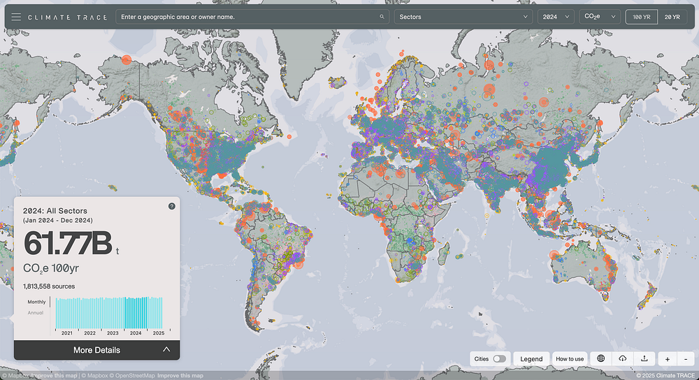
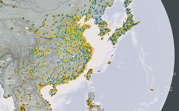
Before September, the Climate TRACE map had displayed each point source of emissions as a circle sized according to the magnitude of its emissions. This created two specific problems we wanted to solve. First, because the global dataset is so comprehensive, there was significant overplotting, with many circles overlapping and obscuring each other, clouding the picture of the global view. Second, the challenge of comparing circle sizes visually made it difficult to tell which sources were the largest contributors.
The Spiky Globe
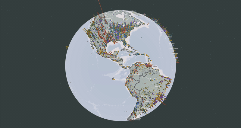
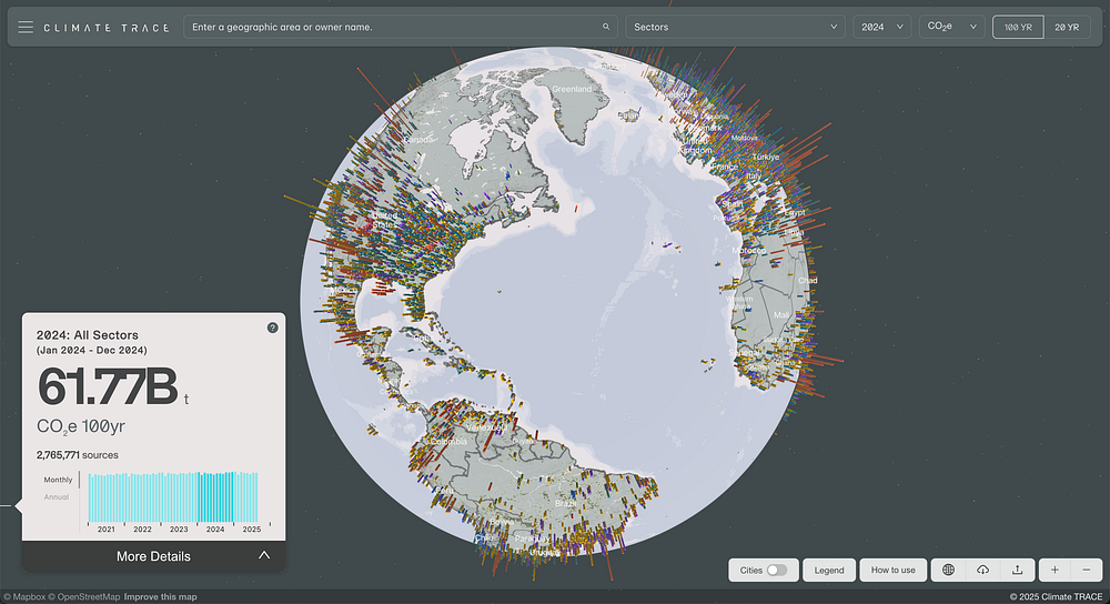
We quickly settled on representing point sources as vertical extrusions because an extruded globe already served as the main visual on Climate TRACE’s landing page. Chosen in part for the emotional impact of a “spikey globe,” which brings a sense of pain and discomfort, the extrusions would also help address both of our main problems: they cause less overplotting because only their height is scaled by each source’s emissions while their diameter remains constant, and it is much easier to identify extreme outliers in height than in radius. But rendering extrusion on a global scale presented a number of new challenges we had to solve.
Optimizing Tile Size
Rendering 3D extrusions with Mapbox requires that the shape of the extruded volume be encoded in the layer’s geometry directly. Because our existing tiles of emissions sources only included point geometries, this meant we had to produce a new tileset with buffered geometries around the points that we could extrude. Moving from single points to whole buffered rings for each point source dramatically increased the size of our tiles, and it also locked us into a single, fixed diameter for the extrusions.
The larger tile size meant that we needed to find other ways to limit the amount of data in each tile to avoid performance bottlenecks. Our original tileset included all the emissions data for each air pollutant tracked by Climate TRACE, and we noticed that we could significantly reduce the size of our tiles by separating each gas into its own tileset. That comes at the cost of having to load a new tileset when the user selects a different gas, but not every user selects additional gases, so a lighter and more performant initial experience was a good trade-off for making that switch a little slower.
Having to choose a single diameter for our extrusions meant that we had to find a size that would work at various zoom levels. Too small, and you can hardly see them at low zoom levels; too large, and you get an even worse overplotting problem than we started with. Ultimately — and unsurprisingly, with this volume of data — we found that some overplotting was unavoidable. So the question became: how can we make the visual as clear and communicative as possible without losing the forest for the trees?
We found our answer by focusing on what we wanted the global visual to emphasize most: the scale and impact of the world’s largest point source emitters. After some experimentation, we found that by filtering out smaller emissions sources at the most zoomed-out levels, we could dramatically improve performance, clean up the visual presentation, and keep the focus where we wanted it to be. Filtering out the smallest sources dramatically reduced the number of geometries that need to be loaded and rendered at the global scale while only impacting sources that are too small to see at that scale anyways.
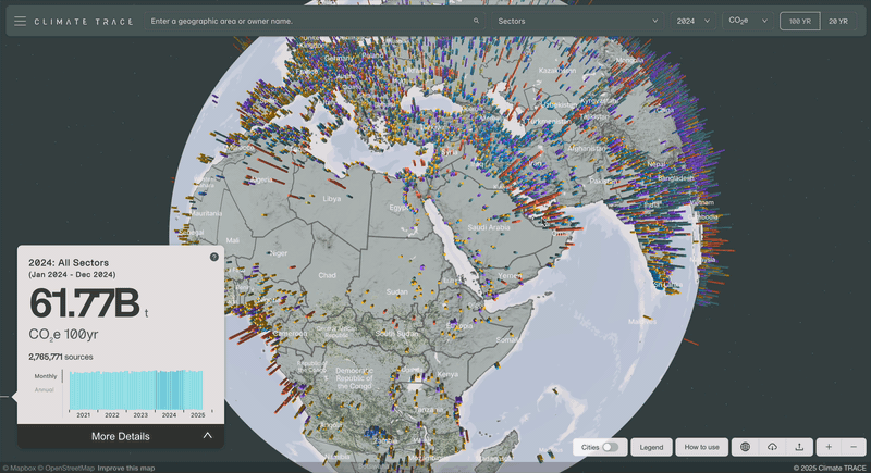
The Earth Is Not Flat
The global projection is a good fit for our presentation because it’s a clear and natural display of global geography, and the three-dimensional wrap of the horizon makes the vertical dimension of the extrusions easy to see. It does present a problem, though: you can’t see the whole globe all at once.
We did want to preserve a display of the global scope of our data without requiring any user input after the initial page load, so we made the globe rotate automatically until the user interacts with it.
The user interaction of selecting a single asset also becomes a little trickier on global projection using three-dimensional extrusions. Luckily, Mapbox’s native click event handlers allow you to identify when the user clicks on extruded geometries, so we were able to preserve direct interaction without too much trouble.
Including Non-Point Sources
Climate TRACE tracks an incredible range of types of emissions sources, not all of which map cleanly to a single point on a map. For example, the project tracks emissions from road traffic and buildings, particularly in urban areas. At the global level, the total emissions from these sources in major urban areas can be significant. In our classic map display, we represent some of these emissions with raster layers, but we wanted to find a way to include them in the extrusion view.
We already had the necessary aggregations of transportation and building emissions in our dataset, so all we had to do was include them in the tilesets of the extrusions with buffered geometries located at the center of the urban area. But then we hit our next challenge: we were aggregating two types of emissions for each urban area, so if we placed them both at the center of the city, they would overlap and you would only see the larger of the two.
Once we identified the problem, the solution was straight-forward. We updated our process for creating the buffered geometries for these aggregations to offset each of the aggregate extrusions by half of the buffer diameter. With that tweak, the geometries would no longer overlap.
Flattening the Spikes
Once the user zooms in, we wanted to return to our original circle-based view, so the last challenge was building a smooth transition between the extrusion view and the classic point view. We wanted the transition to feel natural and also to help the user understand that the two layers represent different views of the same data.
The first thing we tried was a simple opacity transition tied to the zoom level of the map. Changing the opacity of the layers is easy to implement and is familiar and understandable to users. That was a good start, but the height of the extrusions meant that some of the taller volumes felt like they were too close to the camera as you zoom in, making the view feel crowded. This also weakened the visual continuity between the extrusions and circles, despite the cross-fade.
To fix this, we added another aspect to the layer transition: an animation of the extrusion height scale tied to the zoom level. As the user zooms into the globe, the extrusions get gradually smaller, ensuring that they remain at a reasonable scale for the zoom level and blending them seamlessly into the two-dimensional circle layer when it appears.
In the end, we created a compelling global view that helps the user understand the scale and scope of the data. At higher zoom levels, it transitions smoothly into the traditional view, maintaining the detailed, two-dimensional presentation users are accustomed to.
We think it’s a big improvement, and we’d love to hear what you think. Take a look at climatetrace.org/explore and let us know!
Other articles
.png)
The AI Knowledge Problem
Report out on building decision support tools for nature credit project design
.png)

Engineering updates on sustainable AI at Earth Genome
Behind the scenes sustainability improvements on patch grid generation, STAC metadata, energy transparency, and DB optimization.