
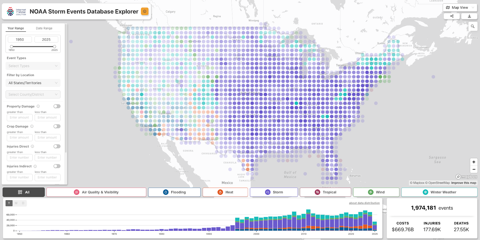
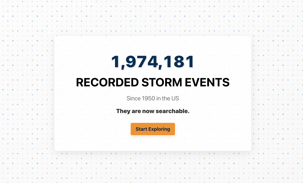
1,974,181. That is the number of storm events we successfully put on a map and made fully searchable. This is the story of how we made it happen.
Do you work with data? Do you ever find that the data you need exists (yay!) but it is painfully difficult to access (sigh..)? Unfortunately, this is an all too common pattern encountered by the scientists and researchers working on many of the most important science questions affecting the world today. These professionals are expected to be both a domain expert in their field and the equivalent of a senior data engineer, which leads them to spend many hours wrangling data instead of actually using the data to help them with their primary goal of, you know - doing science. If 2025 has taught us anything, it’s that funding for important data programs is not guaranteed, let alone funding to review and enhance these datasets. At Earth Genome, we believe in improving, not removing, access to valuable science data.
Exploring the Status Quo
One of our team’s core values is to seek change when we think we can make an impact, and that’s why we were beyond excited at the prospect of working with the Internet Of Water Coalition to build on top of the historic foundation that NOAA’s Storm Events Database provides. With a team made up of staff from the Internet of Water and Duke University’s Nicholas Institute for Energy, Environment and Sustainability paired with the product and technical support of nonprofits like The Commons and our own Earth Genome, we knew we could make a real impact towards breaking down access barriers and improving the overall utility of this valuable dataset.
If you are not familiar, NOAA’s Storm Events Database contains records on various types of severe weather, as collected by NOAA's National Weather Service. This comprehensive database includes records dating back to 1950, with more than 1.9 million documented storm events across the United States and its territories. More specifically, it contains records documenting the occurrence and behavior of storms and other significant weather phenomena having sufficient intensity to cause loss of life, injuries, significant property damage, and/or disruption to commerce across the US.
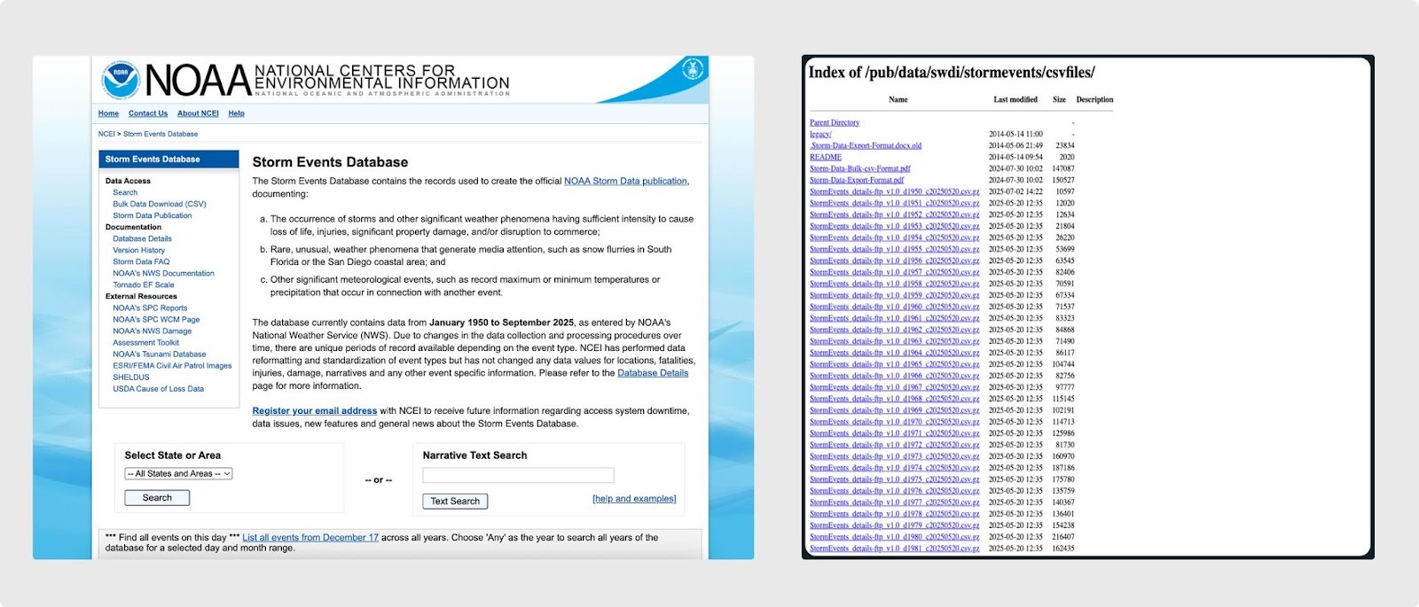
Access to the dataset is available on NOAA’s National Centers For Environmental Information webpage and provides a few ways to navigate the data. The first is via a hosted web form for running limited text based queries, which then generate a tabular subset of data to view or download. The other option is a list of bulk csv files broken out by year that can be used to download more data at once, albeit one year at a time. To get a full picture of the data there are also related files that must be downloaded and joined to piece together a complete dataset. From there, it is generally left up to the user to navigate, search and download the data locally to complete an analysis in their preferred data crunching tools to answer their specific question. This flow certainly provides some level of access but it also sets up barriers to that access which begin to require putting on the data engineer hat outside of a typical user's scientific specialty. Our goal was to reduce the friction and improve the value of the dataset by working downstream of the NOAA products to provide users with tooling that allows for easier and better access to this data.
Exploration and the challenges
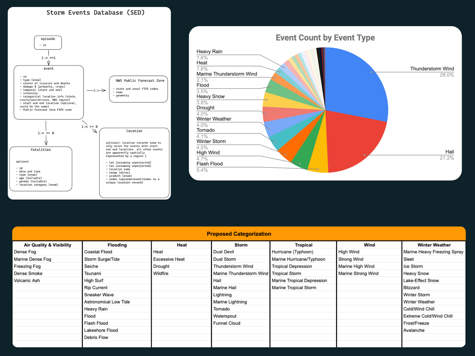
Like any good data wrangling project, we first had to understand the existing data structure and assess its overall quality. The team started by pulling all the files down, reviewing their schema, and reading all the available documentation and directives we could find to determine what challenges we might face. The initial pass revealed that the data, not surprisingly, had some gaps and minor errors, but it also made clear that this dataset reflects years of evolving practices rather than a single, standardized approach. It told a story, not just because it’s a dataset of weather narratives recorded by many different people with unique voices, but also because the types of data included changed over time. Originally, the database only recorded tornadoes from 1950-1955, then it expanded to record tornadoes, thunderstorms, wind and hail from 1955-1995, and in 1996 it expanded yet again to encompass a total of 55 distinct weather event types. Along the way, it evolved through decades of data storage trends, from physical reports to WordPerfect files to an Oracle database and seemingly countless formats in between. NOAA’s efforts to maintain this dataset over so many years can only be described as heroic. The occasional quirky formatting choices and latitude/longitude mixups merely add to the dataset’s character.
During our investigation phase, the team also identified the value of creating categories to add logical grouping of similar events and to break down the long list of 55 event types into a few useful layers that a user might be interested in exploring together. After compiling our initial user personas and conducting interviews with real users of the existing database, we iterated to find a categorization methodology that let us create carefully reasoned groupings to improve and support our ideas for useful data visualizations. The exploration phase also gave us insight into all the data presentation strategies and filtering features we thought we could build out to even further improve access. Combining the data into a single database that could be consistently indexed and quickly searched on its own was a massive improvement over the existing single file download capabilities.
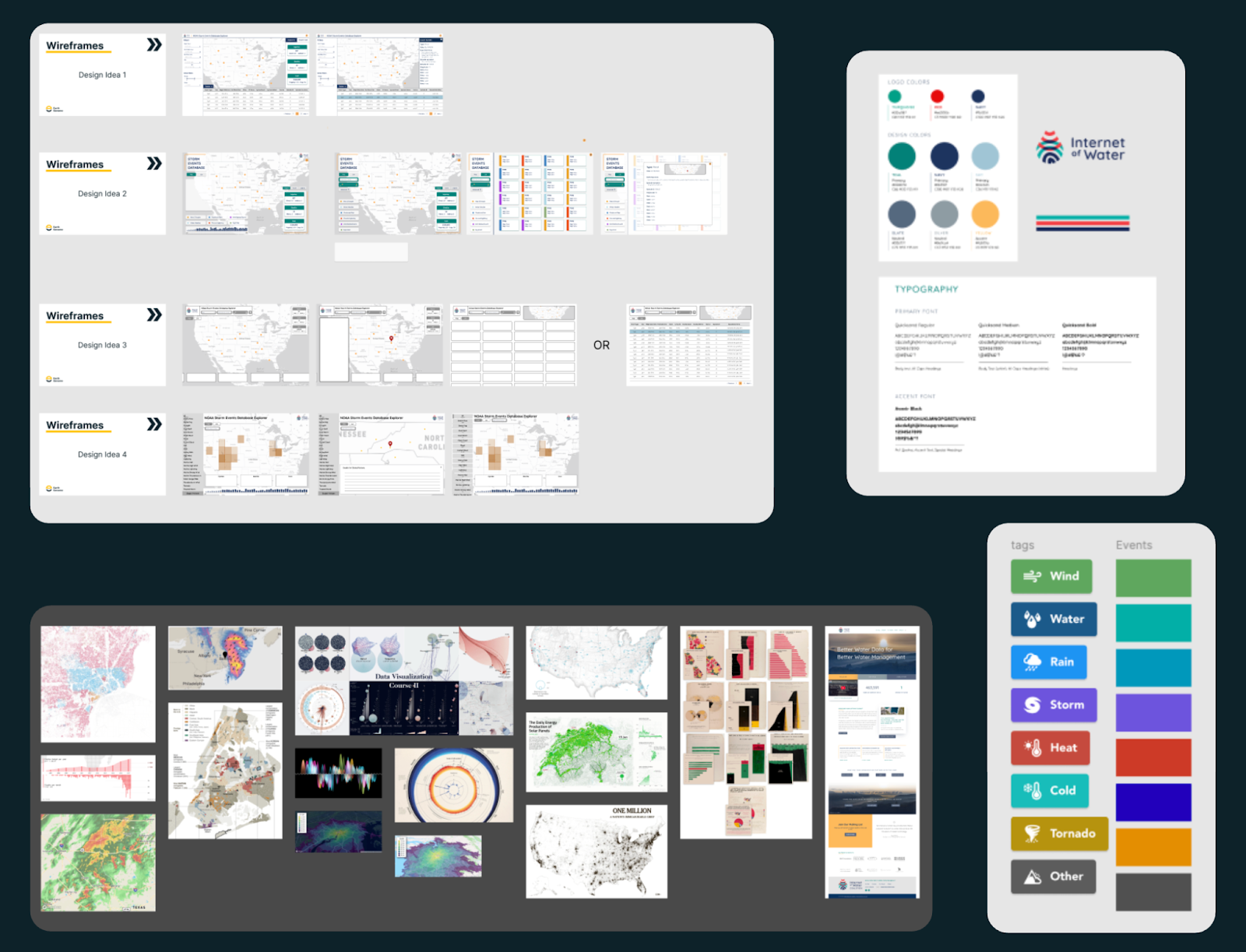
Finally, we landed on recognizing that the data was inherently spatial, ie. storm locations. However, not all of the data values were recorded with coordinates and so some centroid or aggregation methodologies would have to be applied. The size of the dataset, once combined, also presented unique problems to solve - it’s almost getting into big(ish) data territory, which made us have to consider a technology stack that could support the rendering we were envisioning. With all of that laid out in front of us from our discovery phase, we could move on to the design phase and kick off some prototyping to see what would work well for this build.
The problem of (almost) big data
One of the challenges with this visualization was the need to map the data, all nearly 2 million points of it. Simply plotting 2 million points on a map is challenging but pretty doable these days with vector tiles and webGL. However, once we start to dig deeper into the requirements it becomes a little more challenging. From a digital cartography perspective, we do not want to end up with the red dot problem - when we have too many individual points on the map that create visual clutter and do not let the user actually see discernible patterns behind a wall of point markers. From a functional requirements perspective, we also need to be able to filter multiple fields in combination. The real challenge comes when you fix the red dot problem, by using an aggregation like s2, h3 or a dot grid. At that point, we also have to apply filters to the underlying data that then need to be aggregated again to apply the updated view back to the map. This means we are now doing dynamic aggregations of 2 million features based on multiple combined spatial and non-spatial filters... and this gets quite a bit more challenging to overcome.
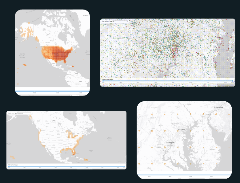
After considering our options and the design ideation that created our technical requirements, our initial solution was confirmed with a quick prototype. We would use PostGIS with pg_tileserv to generate a query that would apply the underlying table and spatial filters first, then roll those results up into an aggregation function for a square grid, which we’d then get the centroid of to create a dot grid (for improved visual clarity) and finally turn that aggregation layer into vector tiles and return that to the client. Easy, right? Well, it actually was surprisingly easy to prototype that out and test the dynamic aggregation pattern by using function layers to pass parameters and then connect the vector tile layer from the tile server to our map on the client side. We even spun up a little UI with a few test filters to try out the dynamic content and it seemed to work pretty well. So with that plan confirmed by our initial prototype, the team was ready to kick off development.
An Experienced Team, Means Experienced Solutions
At this point in the build we had finally hit our stride and the development team was running fast. Until we started to see things slow down…
Unfortunately, there was a fatal flaw in the prototyping phase that came back to bite us. Remember earlier when we said there was some data that did not have coordinates recorded? Well during the prototype we decided to ignore those for the time being, which left us with about half of the total dataset. This made things look like they loaded with enough speed to work really well, but once we leveled up to the full dataset, we found that the dynamic filtering meant the event counts (which are needed for the aggregation dot grid totals) had to be computed on the fly. Repeating that calculation for every tile requested by the frontend quickly put strain on the database leading to a lag in response times.
This certainly was a bump in the road as we’d aligned our application design and functionality around this early proof of concept work. But all hope was not lost. One of the values of working at a small collaborative organization like Earth Genome, is that just because someone is not staffed on a particular project, doesn’t mean the team members can't pick their brain. And after a quick consultation with our CTO to brainstorm solutions, we found that since we were using a fixed square grid for the aggregation we could precompute grid cell coordinates for all events and then store that in a table with indexes. This avoids repeated spatial computations (ST_Intersects) which means faster counts. After that, we were left with one other remaining inefficiency: recomputing counts per tile request. The solution again was grounded in the fixed grid which meant we could create an API endpoint returning simple GeoJSON for grid cell centroids + counts. Normally moving from vector tiles to GeoJSON would be a performance killer however, we only had 1351 grid cells to deal with (and a worst-case payload of 7810 cells if we went with a 25km grid) since our map implementation added aggregation layers only at zoom levels below a certain threshold. Over that threshold at higher zoom levels we already planned to swap and render individual points which meant a shift back to vector tiles, but they were fast since we would be zoomed in and the filtering could happen without the aggregation and count complexities.
Sometimes the solution can be as simple as having the right team members who are experienced enough to know when a pivot should come into play. And this was certainly a time when we were glad to have experienced colleagues to help inform this architecture shift.
The final result: Clearing Barriers to Storm Data
After months of ideation, design iterations, data discovery, prototype testing, a technical pivot and a handful of development sprints we finally did exactly what we set out to accomplish: improved access to valuable science data. The final application not only adds a spatial view into the storm events database, but includes dynamic charts and summarization across the entire dataset. To expand this even further, we also chose to include solid documentation for our API and make the endpoints publicly available for use by anyone that wants to programmatically access the dataset. As a cherry on top, we ran bulk exports of our dataset with the categorizations available and pushed them to source co-op for any larger downloads. We believe that these enhancements dramatically improve access and the utility of the Storm Events Database and going forward the team plans to continue updating and pushing future Storm Events Data as they are released.
To learn more about the project:
Check out the final application for yourself:
- https://internetofwater.org/iow-storm-events-database-explorer
- stormevents.internetofwater.app
Read the case study written by The Commons: https://www.ourcommoncode.org/digital-service-case-studies/sed
Watch the introductory webinar for a walkthrough: Clearing Barriers to Storm Data: Get to Know the IoW Storm Events Database Explorer
Other articles

.png)
Engineering updates on sustainable AI at Earth Genome
Behind the scenes sustainability improvements on patch grid generation, STAC metadata, energy transparency, and DB optimization.


Launching Earth Index Deep Search for comprehensive planetary data
You can now train lightweight classifier models directly on the web
.png)