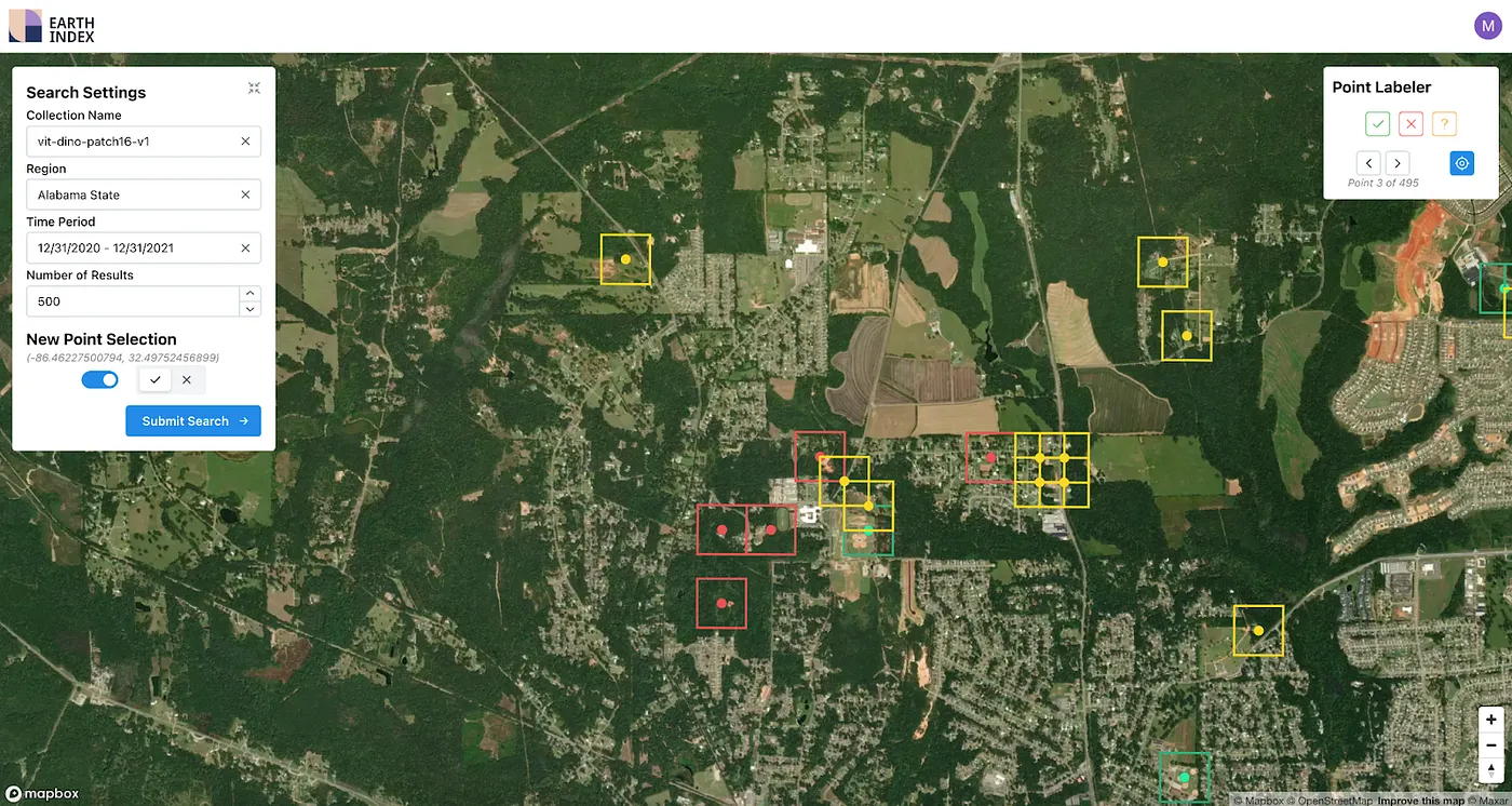
Launching Earth Index Deep Search for comprehensive planetary data
You can now train lightweight classifier models directly on the web
.png)
.png)
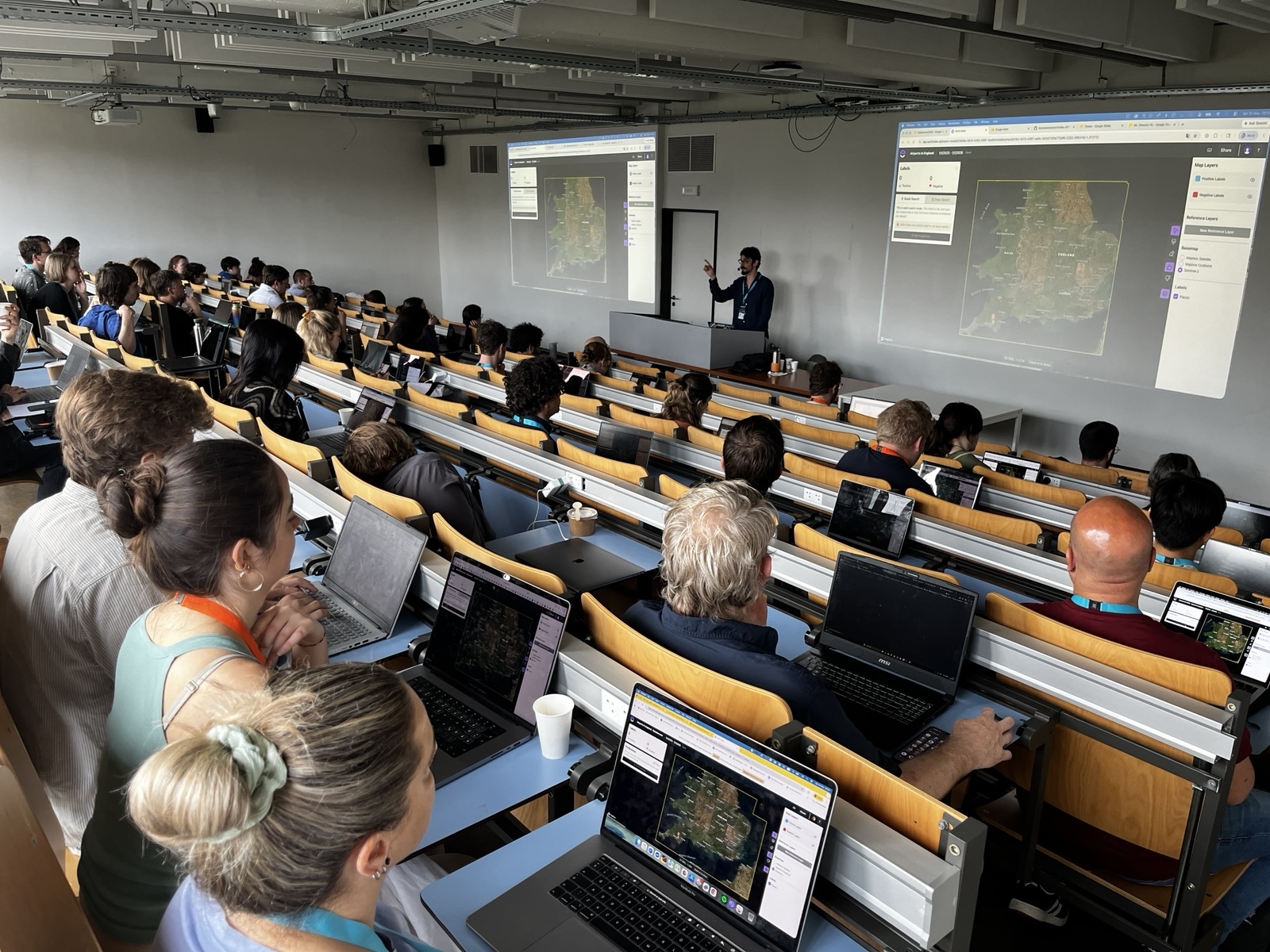
Midstream research note: Rebuilding the Earth Index user interface
We are rebuilding the Earth Index user interface so anyone can quickly find evidence of environmental issues in any region without deploying
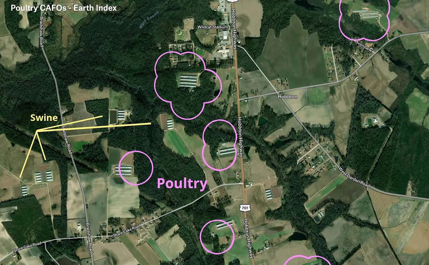
Finding 5 billion chickens with human-in-the-loop AI model tuning via Earth Index
Almost all the chickens consumed in the United States come from factory farms.

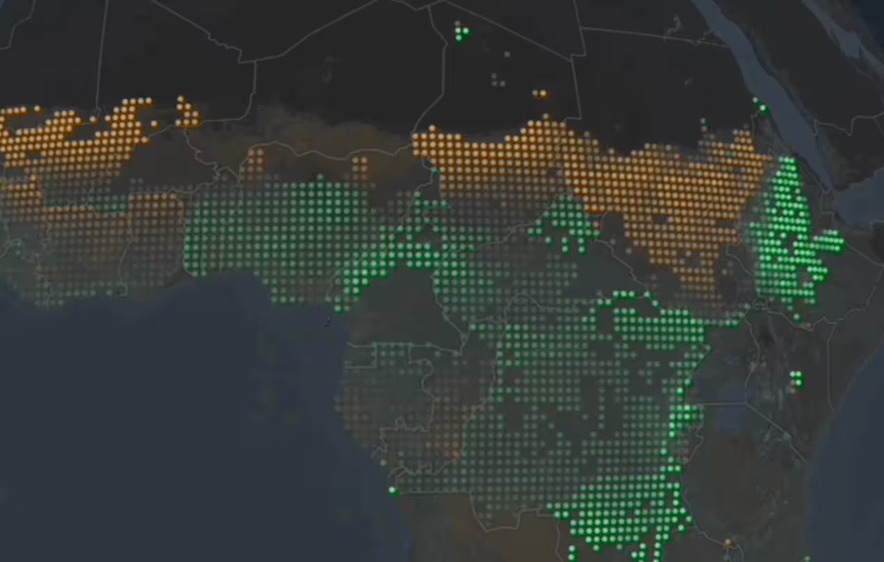
Building the vision for a more sustainable food future in Africa
At COP28 U.S. Secretary of State Blinken announced the commitment of $150 million to develop food crops well-suited to the changing climate in Africa.

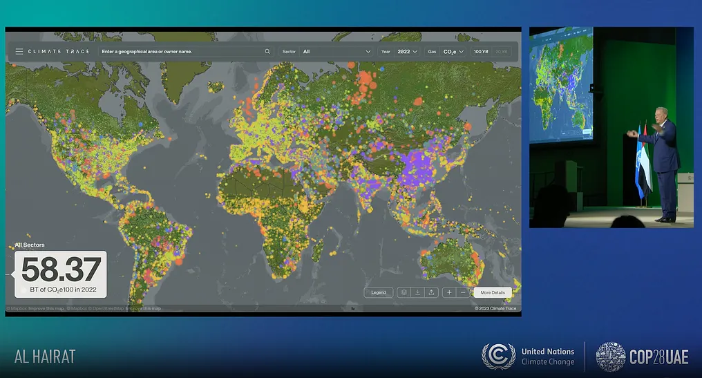
Earth Genome builds the Climate TRACE experience for the most comprehensive and granular greenhouse gas emission dataset ever created
At COP28, Climate TRACE has released the most comprehensive and granular dataset of recent greenhouse gas emissions ever created.
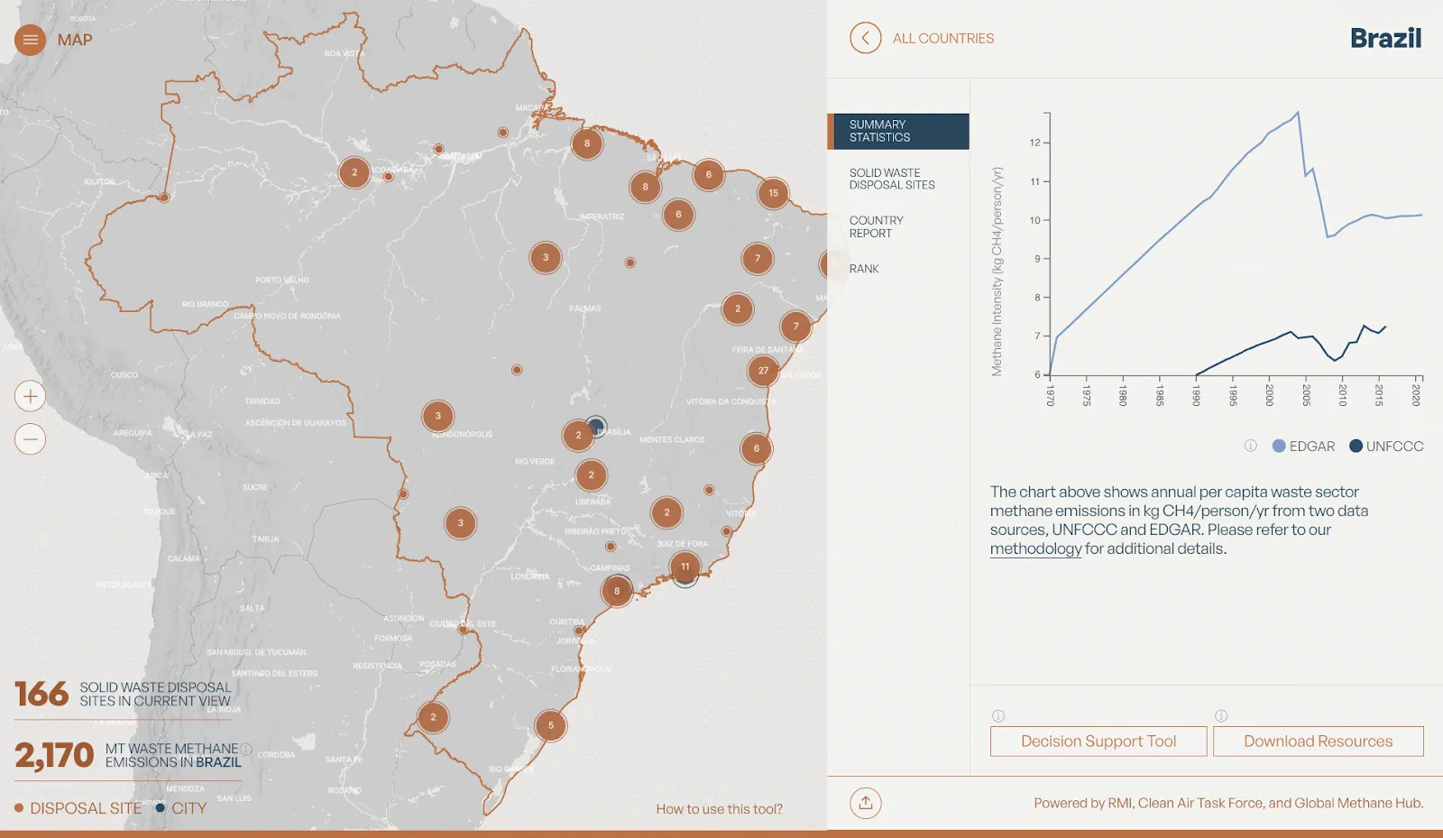
Measuring, mapping and mitigating global waste methane emissions
Today in Dubai at COP28, WasteMAP has launched to comprehensively track methane from waste sites around the world, and enable direct practical action to reduce emissions from this potent greenhouse gas.
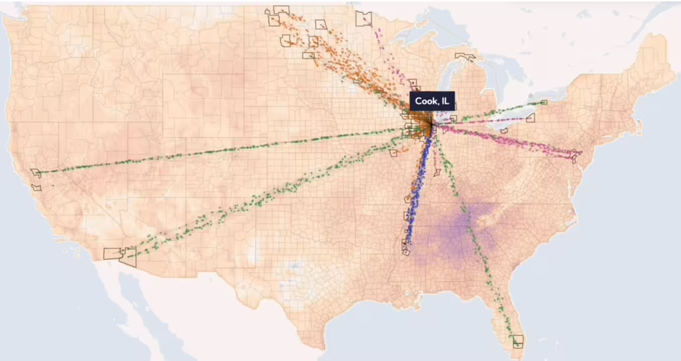
Food Twin: Stress Testing the U.S. Food System
Today the Plotline, the food climate and data community organized by Earth Genome, is launching Food Twin, a proof of concept digital twin of the United States food system.

How we judge Earth Observation foundation model quality, part 1: Intuition building
There are now several AI “foundation models” for Earth Observation (EO) data.

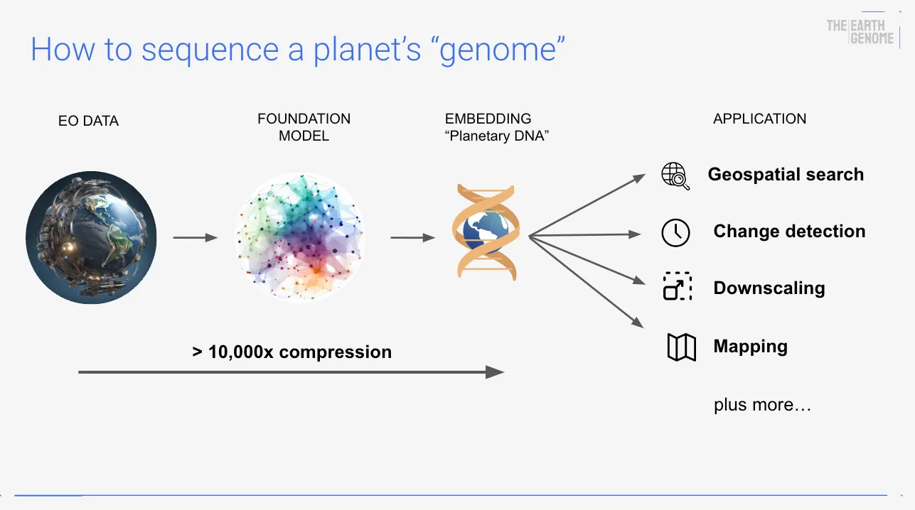
How AI can decode the Earth’s “Genome”
Imagine if we had access to a true “genome” for the Earth, an actionable blueprint that distilled the tsunami of data we collect about the planet.

Finding a Vector Database to Search the Earth
With the vector search landscape changing daily, identifying a vector database to be the backbone for earth observation similarity search at a reasonable cost has proven to be a challenge.