I’ve always believed the best visualizations are simple, tangible, and evoke emotion. A three-year-old and a ninety-year-old should both be able to look at them and immediately feel something: curiosity, concern, recognition, awe. A good visualization shouldn’t require a legend or a tutorial to be understood. It should land viscerally, before it lands analytically.
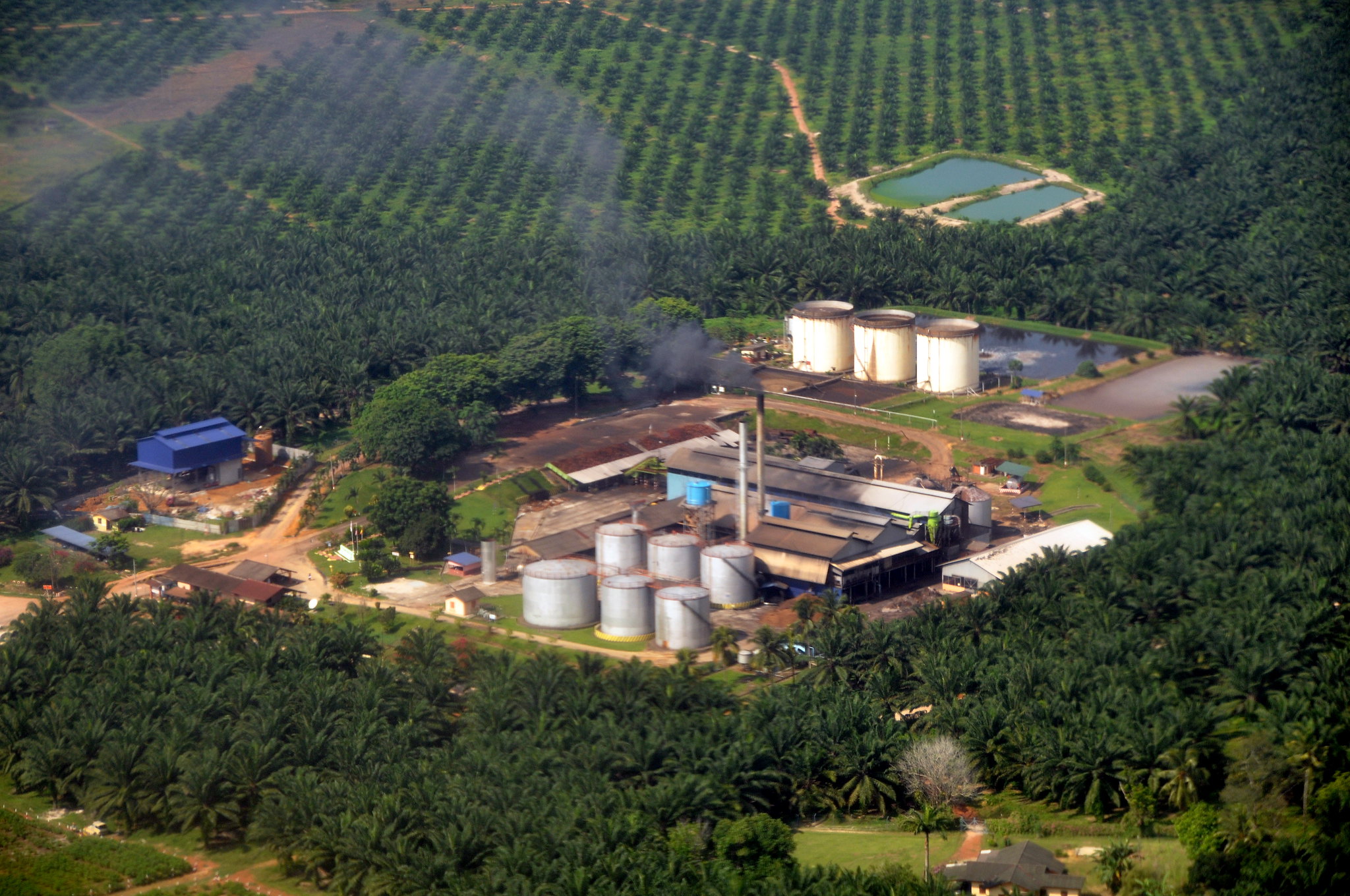
When it comes to climate change, this kind of clarity is especially important. Greenhouse gases are invisible. Air pollution is easy to ignore unless it’s catastrophic. Industrial emissions happen out of sight, behind fences, far from most people’s daily awareness. Yet these emissions shape the air we breathe and the climate we live in.
This year at Climate TRACE, we set out to visualize something that cannot normally be seen: how emissions move through the air, and how communities downwind are affected. Working with the CREATE Lab at Carnegie Mellon University, we built an animated plume layer that brings emissions to life in a way that is both intuitive and emotionally resonant.
Why Plumes?
Pollution moves like a fluid: it spreads, bends with prevailing winds, meanders across neighborhoods, and often combines with pollution from nearby facilities as it travels downwind. Seeing this motion is crucial for understanding lived exposure.
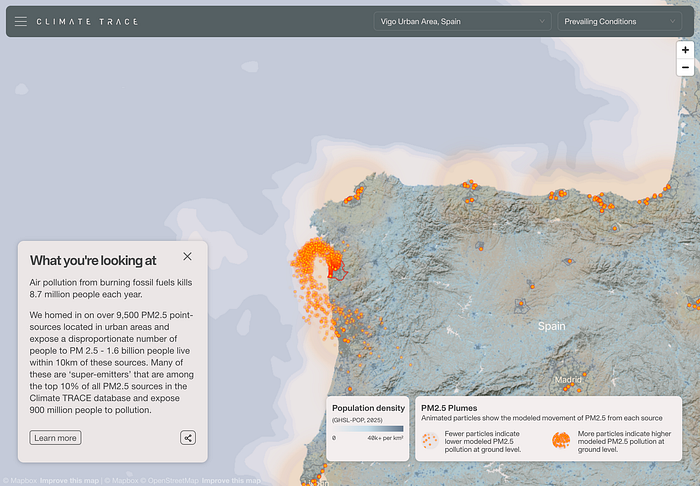
And while the plume layer visualizes PM2.5, not CO2, the emitting facilities are overwhelmingly the same ones driving the global carbon crisis. Power plants, refineries, steel mills, and petrochemical complexes release both particulate pollution and massive quantities of greenhouse gases. In that sense, the plumes act as a visible spatial proxy for carbon emissions. We see the industrial footprints that normally remain invisible, even though their greenhouse gases are warming the planet.
A motion-based view makes exposure more intuitive. You can watch pollution drift into specific neighborhoods, observe how clusters of emitters interact with one another, and see how intensity changes as emissions travel outward from industrial centers. It transforms emissions from a static quantity pinned to a point into something with shape, distance, direction, and consequence.
Aggregation
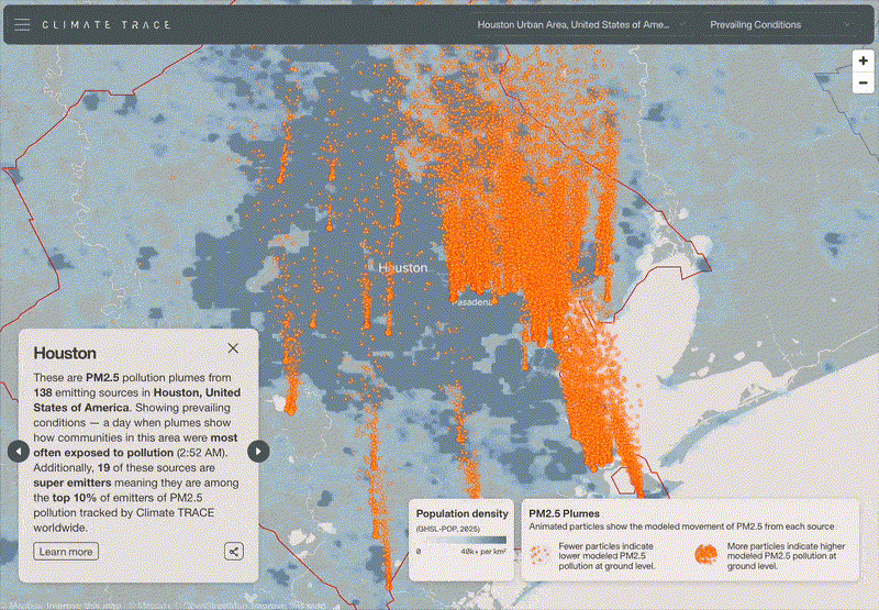
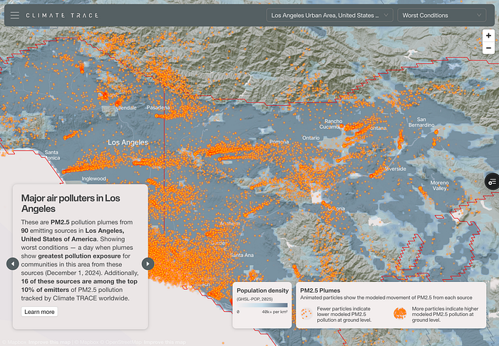
Modeling plumes individually for every emitting asset on Earth would create an unmanageable visual experience, especially in dense industrial regions. To make the visualization meaningful and computationally efficient, we grouped plumes by city. Each metropolitan region was modeled over a 24 hour window under similar atmospheric conditions.

Within each city, all plumes are modeled using the same representative dispersion scenario, producing a coherent field of motion across the region. The particles drift in a shared direction, following the same winds and patterns, which makes the visualization feel physically grounded rather than a collection of independent animations. It also ensures that users can interpret the entire region as a single, intelligible system instead of a noisy scatter of unrelated plumes.
Passive Activation
We wanted exploring plumes to feel natural: no menus, no layer toggles, no clicking through cities. The plumes should simply appear where the user looks.
To achieve this, we designed a system where the map continuously evaluates its own center. Each metropolitan area has an invisible centroid and whichever centroid lies closest to the center of the user’s viewport becomes the active city. The moment the user pans the map, the active region can shift. If they move from Houston toward Baton Rouge, for example, the animation dissolves from one region to the next, effortlessly following the user’s movement without their needing to do anything at all.
This approach keeps the experience light, fluid, and exploratory: users simply move the map, and the plumes follow. Each city’s plumes reside in a small GeoJSON file served through CloudFront. The viewer only loads the file for the currently active city. This keeps memory use low and transitions responsive. Even on modest hardware, a laptop, tablet, or older mobile device, the animations feel smooth and continuous.
Plumes as Linestrings
Instead of heavy raster tiles or dense point clouds, each plume is represented by a lightweight GeoJSON file containing Linestrings. Each line describes the modeled drift path of a single particle emitted from a facility. The geometry itself encodes the physics: where the particle begins, how it moves through space, and in what pattern it disperses over time.

Because the data is encoded as a set of paths rather than rendered frames, the files remain small and easy to stream. And because each line captures a modeled pattern of movement, the visualization can animate smoothly without needing large simulation outputs or high-volume datasets.
Custom Deck.gl Layer
Animating particles along paths required full control over the rendering pipeline, so we use both a custom Deck.gl Layer and a custom WebGL shader to power it.
The shader reads each Linestring as a track and determines where the particle should be at any moment in time. As a particle moves along its line, the shader interpolates its position between vertices, creating continuous motion. The shader also adjusts particle size and opacity based on the altitude above ground level, allowing particles to disappear as they rise higher.
We experimented with additive blending during early prototypes. In this approach overlapping particles appear brighter and glow. While visually striking at higher zooms, it introduced a clear problem when zoomed out: particles overlap almost perfectly at low zooms, causing unrealistic hotspots that exaggerated concentrations not present in the model.

To maintain the integrity of the visualization, we intentionally avoided additive blending. The final design uses a non-additive compositing approach, ensuring that brightness remains consistent, overlapping particles don’t artificially intensify, and the visualization stays honest no matter the zoom level.
Visual Language
In the finished design, the plumes appear as bright orange particles. This choice was deliberate. Against the cooler blues used for population density and land-based layers, the orange stands out immediately, ensuring that plumes remain readable even when the background is visually complex. The warm saturation keeps them legible during motion, helps distinguish emissions from the underlying map context.
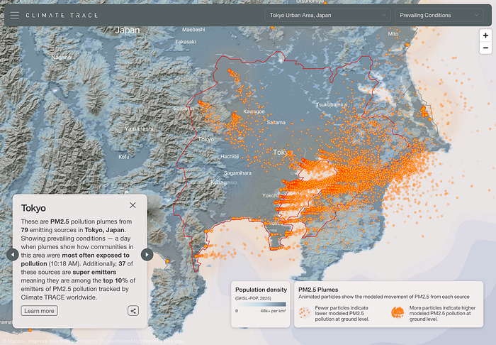
The particles themselves have soft edges and scale appropriately with zoom, but the vivid hue ensures that users never lose sight of the plume’s structure or direction, even when exploring dense urban areas.
You can explore the plume layer at https://climatetrace.org/air-pollution We’re excited to keep refining and expanding this visualization and we’d love to hear what you think.
Other articles
.png)
The AI Knowledge Problem
Report out on building decision support tools for nature credit project design
.png)

Engineering updates on sustainable AI at Earth Genome
Behind the scenes sustainability improvements on patch grid generation, STAC metadata, energy transparency, and DB optimization.