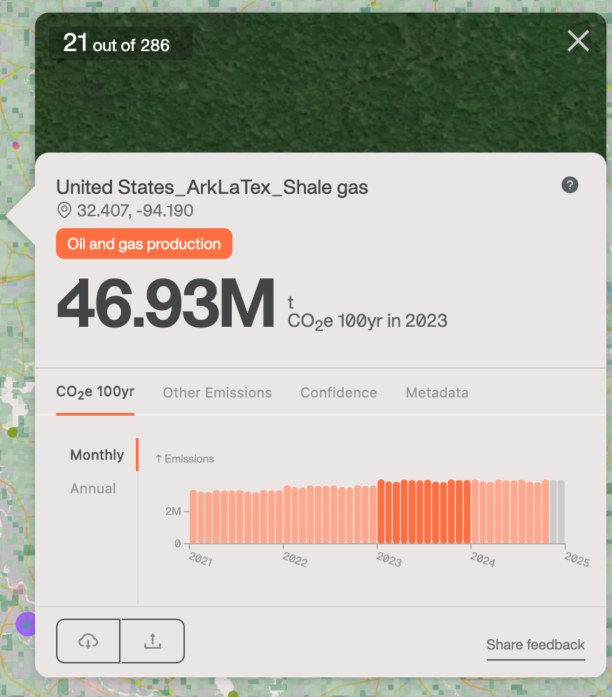
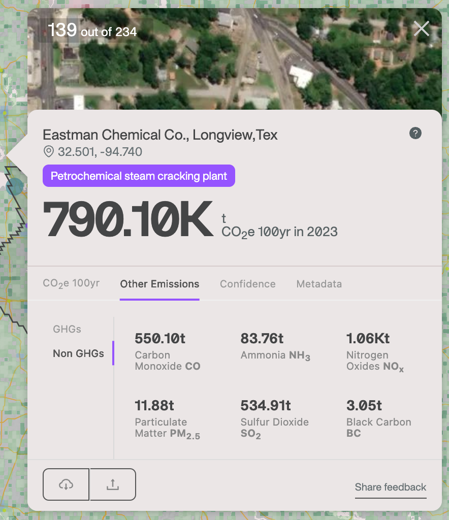
At this perilous moment for the trajectory of the climate, former U.S. Vice President Al Gore and Climate TRACE co-founder Gavin McCormick stood on stage at COP29 and delivered the most comprehensive, detailed, and usable asset level emissions data set to drive action. The collective work of thousands of people in the Climate TRACE coalition has delivered the 2024 data release. This new release has emissions counts over 4 years for 1.8 million individual sources — now for the first time at monthly granularity. In addition, it now includes health damaging non-GHG pollutants, covering every country, state, county and 11,422 urban areas across the globe.
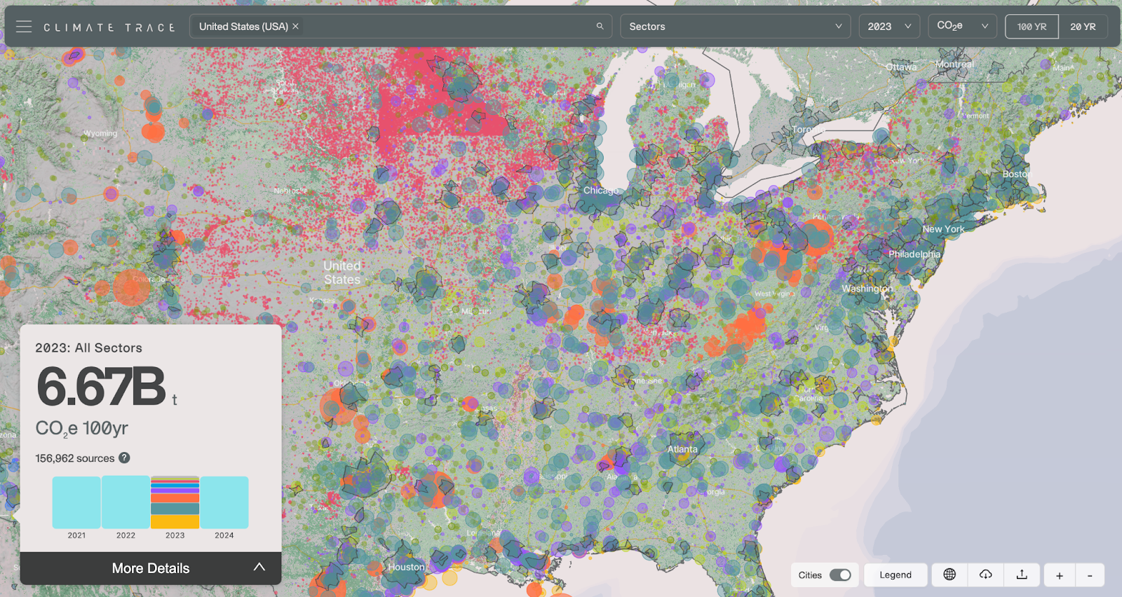
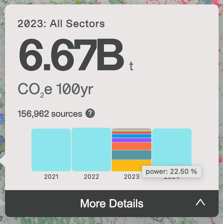
Altogether, this is 100 times more emissions data than last year. Earth Genome responded with a scaled up, robust data infrastructure and a rebuilt, thoughtfully adapted map experience. Our design and development work enables Climate TRACE to support priority use cases of cities and environmental justice, expand access to more users, and surface unparalleled granularity of emissions data. Our team closely examined every part of the cartography, design and interaction of the Climate TRACE map, rethinking several components and applying many small fine tunings. These enhancements result in a dramatically improved and more usable experience. Let’s get into what’s driving Climate TRACE and how we designed and built to elevate this vital data.
What’s driving Climate TRACE


Here we are. Are we going to keep using the Earth as an open sewer? We need to understand where it’s all coming from. That’s where Climate TRACE comes in.
Former U.S. Vice President Al Gore
On stage at COP29, Al Gore powerfully laid out what we face. The trajectory of emissions and heat and their impacts on people, global infrastructure and the natural world are heading off the charts. The political headwinds are heavy, with the changing U.S. administration and dominance of fossil fuel interests in global negotiations (generating high level calls for reform). We can’t despair, but wake up to take action. We must acknowledge the strong positive trajectory of subnational governments — cities and states around the world, stepping up to their role. The direction of industry and corporate sustainability is strong. And energy generation is heading in the right direction, with clean energy accounting for 87% of new capacity in 2023.
Data is stepping up to the moment. TRACE now offers unprecedented monthly granularity and expanded sectoral coverage, including emissions attributable to building heating, several manufacturing types like textiles, and even seagoing vessels attempting (but failing) to hide their movements. The number of sensors available that are specifically tuned to pinpointing emissions is rapidly expanding, particularly with the launch of new methane detecting platforms. With highly detailed data informing actions, decision makers worldwide can prioritize interventions for maximum emissions reductions and make smarter investments that counter global disparities in addressing climate change.

Here’s an example. TRACE has looked specifically at landfills and identified just 100 landfills out of almost 10,000 globally that would reduce methane emissions from landfills by 12%. These aren’t the biggest landfills, but those with the most potential for emissions reductions. This kind of analysis is only possible with sufficiently detailed facility level data.
And by the way, Earth Genome is increasingly helping to actually build Climate TRACE data itself. For landfills, Earth Genome helps build and utilize WasteMAP and Global Plastics Watch. And newly this year, we’ve been working closely with the coalition to identify large scale cattle operations globally using Earth Index. More to come on that work soon; meanwhile the extensive methodology documentation shares some details.
At COP29, the discussion moved from “what is TRACE” and “how reliable are its innovative methods”, to “how can this data be used right now”. It’s worth watching all of the speech, or if short on time this is a good post with highlight clips.
More intelligible cartography
This much data takes careful cartographic design to have any chance of producing a clear and comprehensible map.
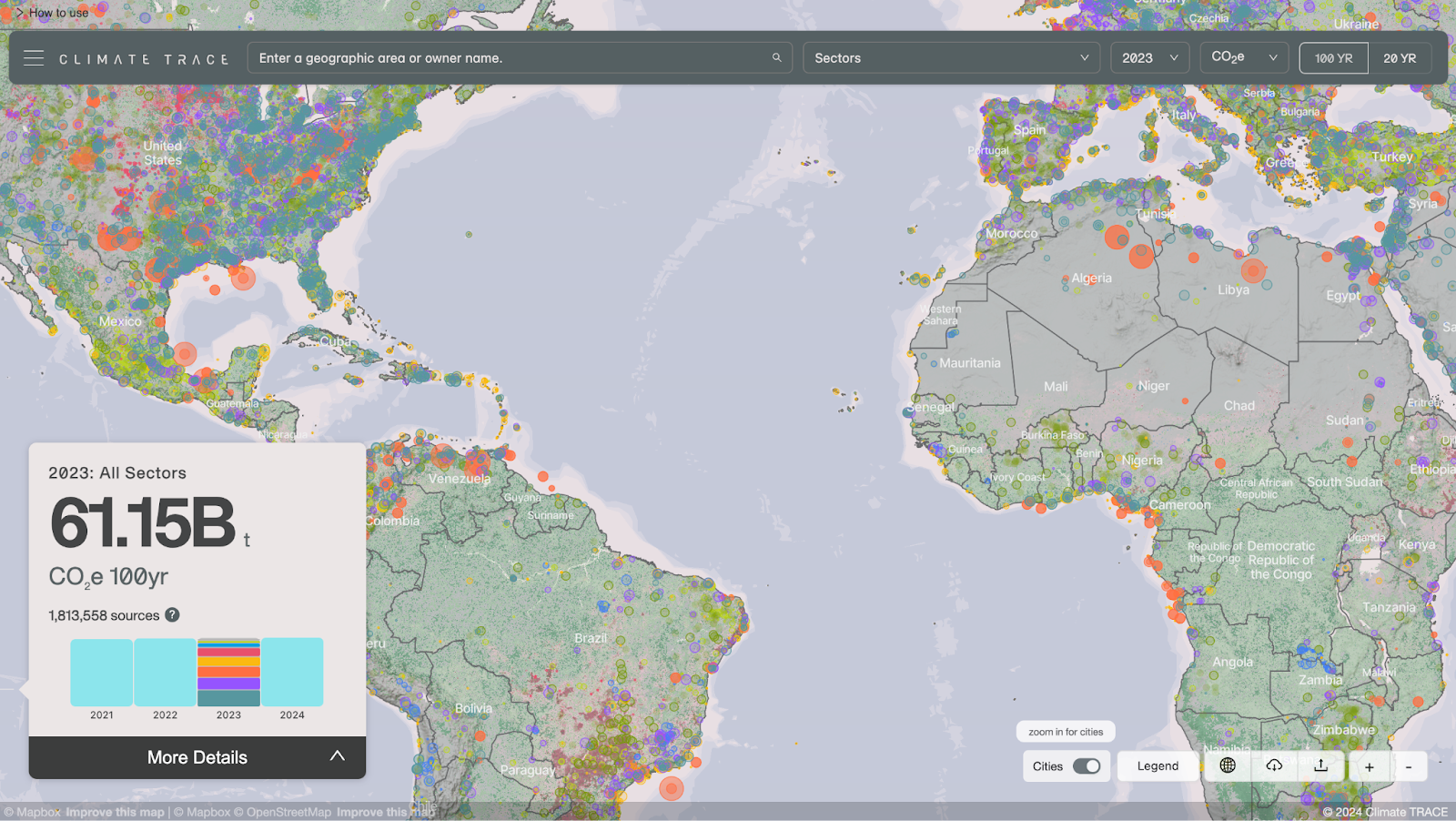

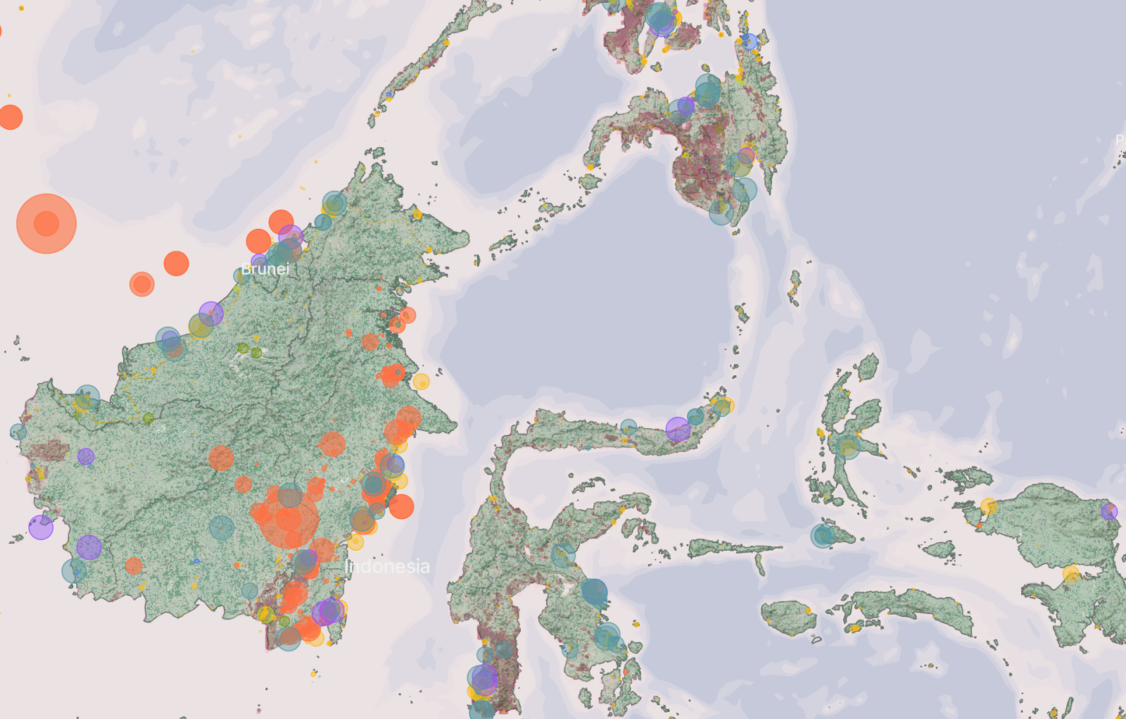
The cartography of the base map was significantly lightened to increase the intelligibility of both point emission sources and gridded data sets. The color palette for water and land was adapted from the color scheme from the site’s content pages. Point sources are semi-transparent with a solid outline to allow a high volume of sources to work together.
Other articles

.png)
Engineering updates on sustainable AI at Earth Genome
Behind the scenes sustainability improvements on patch grid generation, STAC metadata, energy transparency, and DB optimization.


Launching Earth Index Deep Search for comprehensive planetary data
You can now train lightweight classifier models directly on the web
.png)